Google adds gradient to apps' logos
It was going to happen soon enough.
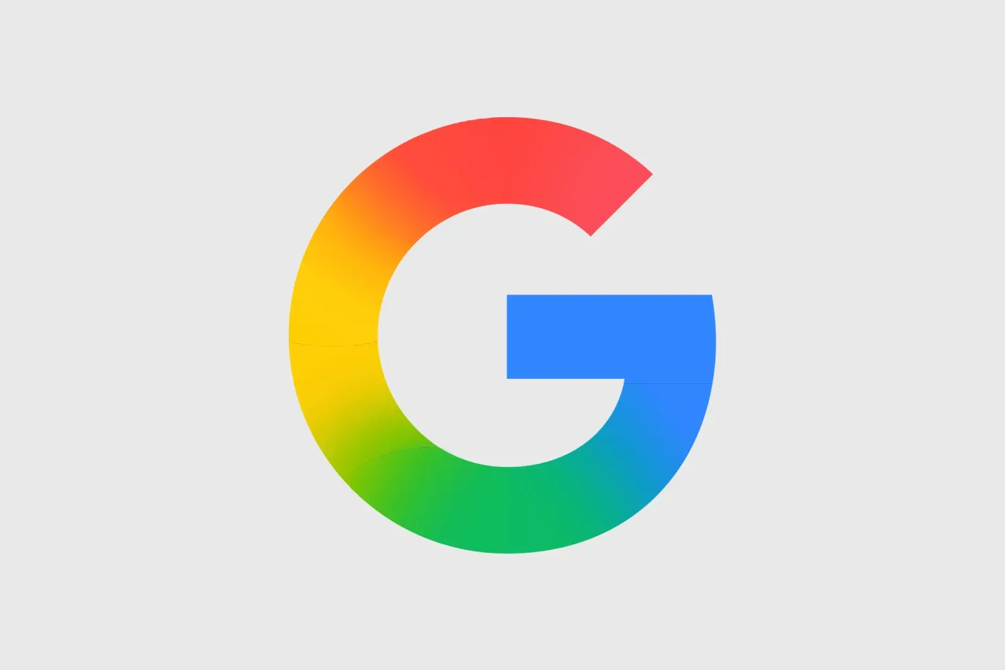
Recently, 9to5Google shared information about the upcoming redesigns to Google's platforms like Google Drive, Docs, Sheets, Gmail, and much more. These redesigns add the gradient look that Google subtly added to the main logo a handful of months back. The original design change swapped out the clear cut color blocks for a smooth, gradient color scheme, and it appears that it is extending throughout their products.
In addition to the colors becoming gradients, the designs of the icons are changing overall as well, with more simplified, almost cartoonish icons. The clear, unified visual scheme looks great and connects the platforms back together. For example, the new Sheets logo is much more round and simplified than it was before, while still having the same general column and row elements. This simplification connects the brand much more, as the current Google logo has this simplicity already through its gradient.
This is also similar to what Xbox has recently done, though in a different way. While Xbox decided to return to their green logo roots, Google seems to be moving more towards a future-looking simplified approach. Both plans, however, work to simplify the brands, and honestly, do a great job at it.
The one cautious thing about Google's redesign is that people already very much know what the Google product logos look like. The brand identity they have already created is strong, and throwing that away may not be the best idea. However, once they already made the move with the Google logo, moving forward with the rest may help to create a new brand identity that will stick just as well as the old one.
Google's new product logo designs are great, and simplify the brand's image in a new, gradient-style way. We will have to wait and see what Google does soon.