Google adds new vertical tab layout to Chrome
It's becoming popular again.
On Tuesday, Google announced that they are starting to roll out a vertical tab layout on Google Chrome. This will be coming to all devices soon, with the first devices being desktop operating systems like Windows, macOS, and ChromeOS. This feature is one of the biggest changes to Google Chrome we have seen in years, and is a radical new way of thinking and interfacing with the internet.
Though this design is not new, with browsers like Arc already having this feature for a number of years now. However, Google adding this could make it the norm, since Chrome already has a 66.7 percent market share. Bringing this feature to the masses could standardize it for all browsers. Chrome is essentially the last browser to include native vertical tabs, with the only other one being Safari (sort of, since you can view the tabs in the sidebar, but there is no way to hide the top bar).
This streamlines the view to get more vertical space for viewing content. This disrupts the norm, since browsers, and our perception of the internet, is based on the wider view of apps. This more square aspect ratio for viewing content is certainly something to get used to, but it seems as though people are loving it after a while.
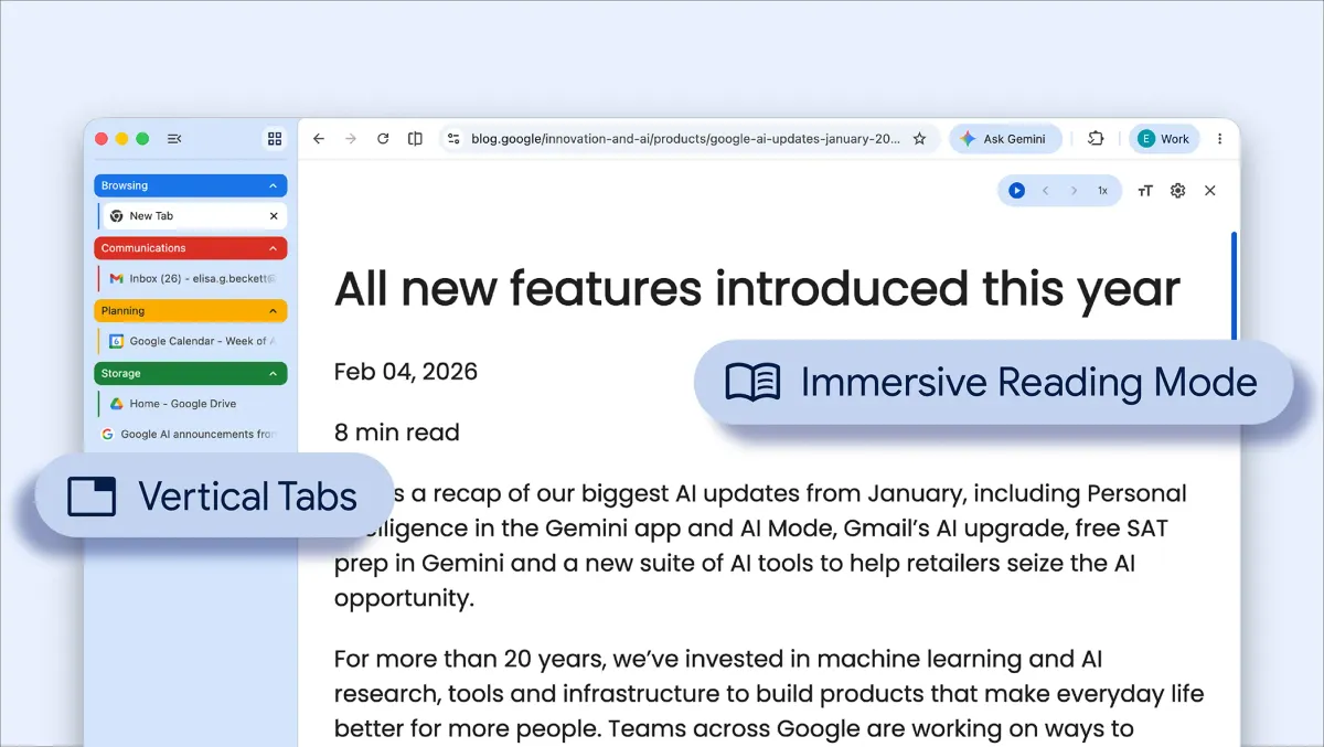
Google shared a view into what this looks like, and how you can hide the tabs on the sidebar, so you get the entire space to work with. Then, if you need to read the titles, you can expand it back out again.
This looks great, and should bring a better experience to the browser. General multitasking on Chrome has always felt a little slow to me, especially due to the high RAM usage of Chrome. So, streamlining the interface should bring back a sense of quality and ease of use that Google's products should have.
Google Chrome's new vertical tabs look to be a great new way to multitask and view content better, while staying focused. We will have to wait and see what Google does soon.